Thursday 23 December 2010

Location Drawing - Huntarian Museum

I was going to include these images in the previous post, but there was a few of them so I thought I'd give them their own post.
All of the following images were drawing at the Huntarian Museum, London. It's an awesome museum filled with creepy and interesting things in jars and on display, such as bones, skulls, dead animals, human and animal foetuses, organs, etc etc. You get the picture.


 These first two were done on my first trip there. Unfortunately I only had barely an hour there so I only managed to get 3 or 4 pictures done. The first picture is a collection of the infant kangaroos at various stages of development that were on display. I was particularly interested in their feet and hands. The second is a quick blind drawing of a puppy foetus. There's a little information about the subjects noted on the images.


These 4 were done on my second trip there. I had more time to look around and focus on particular things this trip, and the majority of the images I did were successful compared to the first trip were they weren't so. The drawings are all labelled and described in the images themselves.

Wednesday 22 December 2010

Various Location Drawing

Over the last few months at Uni I've been doing various location drawings. I thought I'd share some of the better ones from the sketchbook. The following pictures have been done on location in Herne Bay, Kent and the V&A Museum. Huntarian Museum and Pollocks Toy Museum in London.


This one was drawn in Herne Bay, Kent. I went back there for a week on my week off from Uni, and did my three days of location drawing then. This one was my favourite of the three days worth. I quite like how the text worked out having not done it on the sign post itself but rather around it.

These were drawn in the V&A Museum in London, from the ceramics level. These two pieces really caught my eye, not only the pieces themselves, but their style also. Having no brown paper to work on, I coloured the paper with a brown pencil, shaded with a black pencil and did the white markings with a tipex pen.

The next few were done in Pollocks Toy Museum, London. It's an amazing little museum and shop and I really recommend checking it out. Anyway, the above images were of this fantastic rocking horse that was stood proudly on a pedestal on one wall. The sketch was a quick blind warm up, followed by the neater line drawing. The image below is of various carved wooden toys. The carved toys that were on display there were all amazing and I found them so captivating. Had I had more time I'd have focused on a few more, but during the short time frame I had in the museum, these were the only ones I could get down.

Friday 10 December 2010

All I Want for Christmas is You

Yesterday and today I have been working on a 2 day project at university with the current 3rd years.
We were all allocated a particular christmas number 1 hit which we had to illustrate in the form of a christmas card. The brief was pretty open other than that we had to incorporate both the card and it's envelope, and our main colour theme had to consist of Forest green and Mint green.

My allocated song was Mariah Carey's 'All I Want for Christmas is You'.
Being such a painfully cliched and cheesy christmas song, I wanted to take my card away from that and not include the usual iconography of christmas.

By deconstructing the lyrics a little, I realised that they fit really well with the idea of a woman in her final stages of pregnancy at Christmas time. Here's my initial notes on the lyrics sheet I was given so you can see a little clearer where I'm coming from...


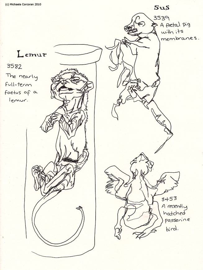
So, I began testing out different combinations of the colours and playing around with ideas. Luckily I'd been to the Huntarian Museum earlier in the week and had drawn a few foetuses that they have in the jars there, so I had some reference material to go by.

And so I decided on what I was going to do. The outside of the card would be the mothers belly, with her hands supporting it, and inside the card would be the foetus, almost like you're opening up her belly to see him, the way I'm sure she wishes she could. The outside of the envelope would have an illustration of the line 'holding on to me so tight' which I love. Babies have a very tight grip, so I decided that I'd draw the simple but powerful image of the baby holding his mothers finger.

I think the project turned out successful. Overall feedback from the group and the 3rd years was very good. So without further ado, here's the final images. I appologise for the creasing of the last image. It's not that bad in person, it's just the scanner picked it up quite badly.


The first two images were done using fine liner and promarkers. The last image was done on photoshop, with fine liner drawn over.

All in all, I'm very happy with the result. :)